 18.12°C Kathmandu
Sat, Apr 25, 2026
Arts
From the eyes of a woman
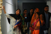
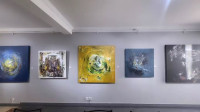
Open for public viewing since International Women’s Day, the exhibition ‘Inspired’ displays the works of nine women artists who have laid bare their stories, culture and perspectives on canvas.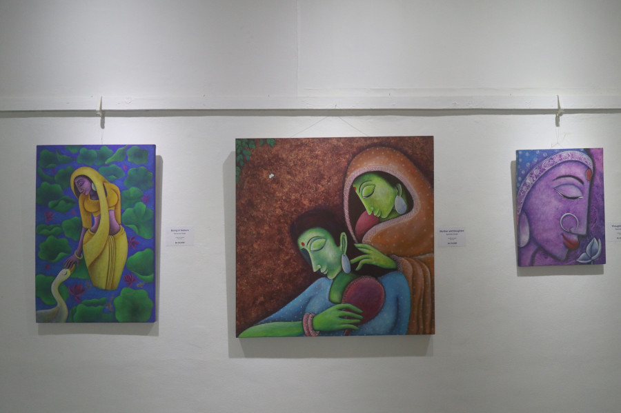
bookmark![]()
Beeju Maharjan/TKP ![]()
Beeju Maharjan/TKP The exhibition will be held until March 17 at Nepal Art Council, Babarmahal, Kathmandu.
Ankit Khadgi
Published at : March 11, 2021
Updated at : March 11, 2021 01:39
Kathmandu
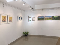
Just as you enter the first floor of the Nepal Art Council, you see various pops of colours. There's bright red, parrot green, sky blue. All of them are displayed in the paintings of Namrata Singh, which are inspired by Mithila art. All of them immediately draw the attention of the viewers.
Singh’s paintings are part of the ongoing exhibition ‘Inspired’. Opened for public viewing since International Women’s Day at the premises of Nepal Art Council, the exhibit by Higher Ground Nepal is a rare, women-only exhibition presenting the works of nine artists.
In each artwork, simple or complex, all artists have presented their own stories, views, culture, and perspectives, reflecting their experiences. While every artist deserves applause for their efforts, only a few of them through their artworks make an impact, and one such artist is Singh.
Singh brings the culture and art of her Mithila heritage alive through her works. For instance, in her painting 'Warmth’, we see two lovers embracing themselves. The man, who is wearing a turban, is resting his head on the shoulder of a woman, who has her head covered with a bright blue ghoonghat (headscarf). In the clothes they're wearing, we see fine details and patterns of various things like fish, elephant, birds, which are commonly used motifs of Mithila art.
The painting is aesthetically pleasing to look at. And through the fine little details, Singh elevates its quality.
Another equally poignant work in the exhibition belongs to Sangee Shrestha. Unlike other artworks, her paintings demand time from the viewers. Rather intriguing motifs are placed on the canvas, which the onlookers need to understand by giving all of their attention to the paintings.
For instance, in her painting ‘Identity’, with the help of intriguing motifs, Shrestha tries to convey the message that an individual should always have a unique identity. While the message isn’t exactly clear, through the help of geometric mosaics and colours, she succeeds in achieving her intentions.
In the lower part of the painting, Shrestha paints a curve shaped-structure in dark colours. On top of that structure, another geometric mosaic structure stands, which is filled with light colours. And through this contrast of colours, Shrestha tries to depict the striking difference between individuals who have their own identity and those who don’t.
In the painting, those individuals who have their own unique identity are represented by the standing structure. The bright colours of the structure resemble their bright personalities, and their placement in the painting is a testament to their positioning in society.
Similarly, the curve-shaped structure is a representation of those people who don’t have an identity of their own and through its juxtaposition in the painting, Shrestha is able to depict the lazy and laid back nature of such people.
One of the most powerful, underlying motifs, however, in her artworks is the representation of the faces of people. Although the motifs are not overtly evident, it is a recurring theme, which is presented in all of her paintings that are in the exhibition. Through such small details, she gives a human touch to her works that otherwise feature only geometric shapes and have no deep meaning on their own.
Sabita Dangol’s artworks are also intriguing. Dangol uses familiar motifs in most of her works. For instance, she mostly uses combs in her artwork, which is a metaphor for the solution to untangling life’s mess. In the works presented in this exhibition as well, Dangol does the same. Yet, despite how recurring the theme is, because of how aesthetically pleasing her works are, her works are fascinating.
Take for example her work ‘Conjugal Life’. In it, Dangol creates a beautiful painting that has her signature motif, a comb, as well as faces of a man and a woman, who are lovers. Playing with the hues of red and pink, through the help of these colours, she tries to depict the passion, the playfulness, and the love between two people who are in love and have decided to spend their lives together.
Similarly, we also see various kinds of patterns that she incorporates in the comb. A bird and a mythical animal are also juxtaposed on the faces of a couple, giving an enigmatic feel to her work.
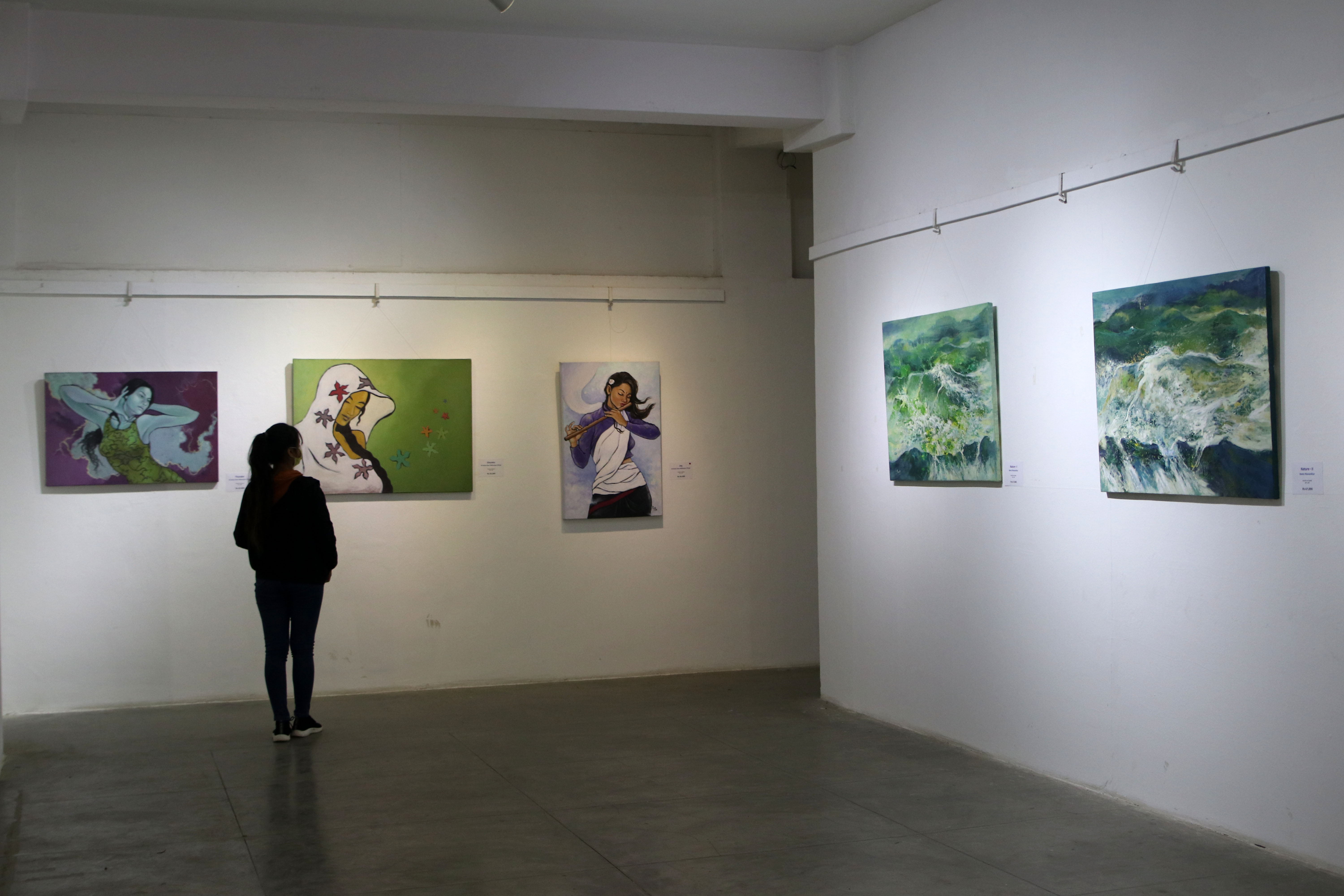
Making nature the theme of her artistic creations, Reeta Manandhar's ‘Nature’ series in the exhibition is also visually engaging. Although a few of her works feel very ordinary, works we have been seeing for ages, like the ‘Nature V’, a landscape painting of snow-capped mountains and lush green hills, it’s her other works that can make a great impression on the visitors.
For instance, in ‘Nature-I’, Manandhar paints an alluring painting, where we see a confluence of different colours mainly green and white. Although it’s not clear what Manandhar is trying to paint, one can imagine that in the painting she is depicting the tides of the ocean, which strikes whatever comes its way.
And that’s the beauty of her artworks that are displayed in the exhibition. It’s difficult to understand what she has painted, as there are no definite shapes, yet her painting’s gravitational force is so strong that one is immediately drawn to have a look at it and get lost to the beauty of nature, which can be anything, as per their imagination.
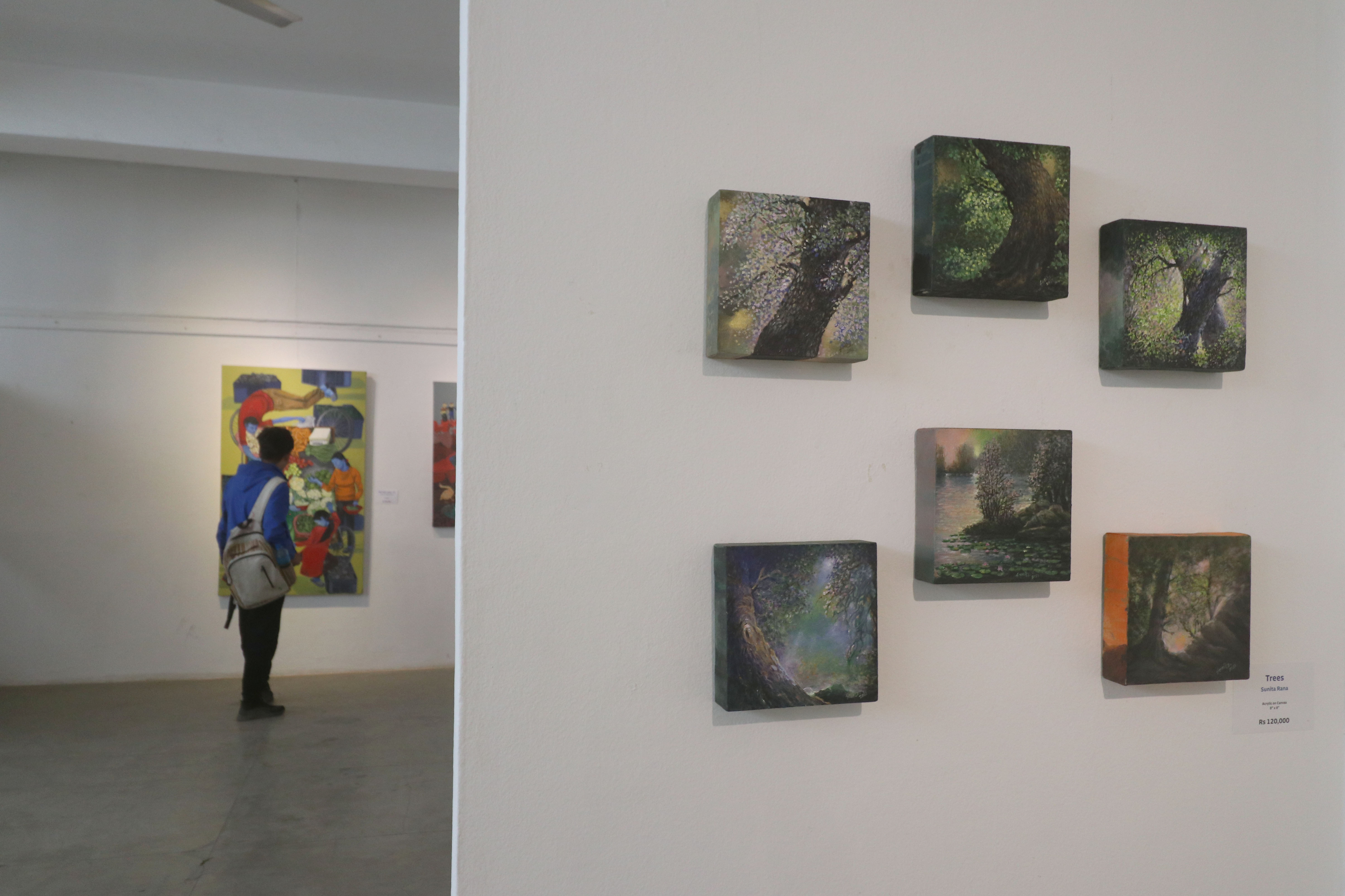
Meanwhile, both Pradhi Rana and Sunita Rana artworks are also good to look at, however, they lack enough substance to hold the attention or leave a big impact.
In the exhibition, details or information—except the title—about the artworks are not provided. For a viewer, this lack of information can diminish the effect the artworks can leave. More than that, it can lead to misinterpretation of the artwork.
For instance, in the artwork ‘Purification Bath’ by Jasmine Rajbhandari, the artist depicts the customary bath that is performed on the day of Rishi Panchami by Hindu women. This custom, which is inherently sexist and stigmatises menstruation, includes women taking a bath with an intention to ‘purify’ their body with a belief that they will be forgiven for their ‘mistakes’ committed during their menstrual cycle. In Rajbhandari’s work, we see the artist has painted four women taking a bath. Likewise, there are various motifs present in the painting, like amala, peepal and other medicinal plants which are used in real-life by women while performing the tradition as well.
Although the artist did say that through her artwork, she is trying to question such traditions to some extent, however, the artwork feels more like a depiction rather than a criticism of such sexist norms. In the painting, we neither see any motifs nor use of colours that signify the denouncement of such discriminatory tradition. Rather it feels like a representation, which can unconsciously or even consciously help normalise such misogynistic behaviour because of the reproduction of knowledge through the artwork.
Even if the artist had other intentions, to be honest, her artwork for many viewers can be regressive. And since there is no information about the artwork, except the title, the chances of misinterpreting the artwork, even if the artist had other intentions, is very high.
And this is where the curator could have done things differently. It’s always fascinating to understand how the minds of the artist work, and how they connect with their own work. Maybe a few lines that conveyed the artist’s intentions and the emotions they went through while creating the artwork could have elevated the art-viewing experience, making it a memorable one. Likewise, since the whole floor is filled with paintings, the curator of the exhibition could have also given space to installation art, or any other medium of art, to break the monotony.
Ankit Khadgi
Khadgi is a queer journalist currently based in Chicago.

%20(1).jpg&w=200&height=120)
Most Read from Arts

Editor's Picks

Inside the Rs 3.73 billion fraud investigation shaking Nepal’s business elite

How Nepal silences women in public life

Prime Minister Balendra Shah resets Nepal’s diplomatic posture in a single day

Nepali woman left for a caregiving job in Israel. She ended up in Palestine

EV demand in Nepal is growing but so is cost
E-PAPER | April 25, 2026
×