Exhibit review: In ‘Dialogue and Perception’, colour does all the talking
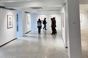
At The Kalā Salon, Sagar Manandhar’s newest body of abstract paintings is a conversation where colour, texture and rhythm become languages of their own.Courtesy of The Kala Salon
Some exhibitions ask viewers to search for meaning. Others ask them to surrender to feeling first. Sagar Manandhar’s latest exhibition ‘Dialogue and Perception (Sambad ra Dristikon)’ belongs firmly to the latter.
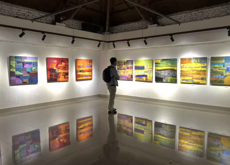
Stepping into the Kala Salon, what strikes first is not the subject matter but the remarkable harmony of colour. Every painting appears to revolve around a dominant hue, allowing secondary colours to grow organically around it. The canvases are saturated with vivid blues, oranges, yellows and purples, yet they never descend into visual noise. Instead, the colours settle into an unexpected balance, creating works that feel energetic without becoming chaotic.
The exhibition is unmistakably abstract, but abstraction here never feels directionless. Strong geometric forms anchor each composition while carefully maintained lines provide structure beneath the apparent spontaneity. There is discipline behind every gesture. Thin borders often frame the compositions, suggesting restraint, yet somewhere within each work a section seems determined to escape those boundaries, pushing outward as though the painting itself refuses confinement.
Walking through the exhibit, one begins to recognise a distinct visual language. Certain rhythmic squiggles recur throughout the paintings, resembling sound frequencies frozen into colour. They weave across the canvas like vibrations made visible, hinting that the artist experiences the world less through objects than through resonance. Even the sequencing of the paintings within the gallery feels intentional, almost as if viewers are moving through different movements of a musical composition.
It is difficult to mistake these paintings for anyone else’s. Despite experimenting with new techniques and materials, Manandhar has developed a recognisable signature. His brushwork, layered acrylic lines and rhythmic mark-making create a consistency that ties the exhibition together while still allowing individual works to explore different emotional territories.
SHRINKHALA CHAND THAKURI/TKP
Texture plays an equally important role. Paint bubbles emerge from the surface, thick acrylic ridges catch the light, while scratched lines and raised forms introduce a physicality that photographs cannot fully capture. In many works, the surface itself becomes part of the narrative. The acrylic seems alive, refusing to remain a passive medium.
Manandhar reinforces this relationship with material through his process. Rather than treating paint as something secondary to the final image, he describes acrylic as carrying emotion in itself. He speaks less about controlling an outcome than about trusting the process, allowing meanings to reveal themselves as he works. His abstraction is therefore not an attempt to conceal meaning but to discover it.
That philosophy becomes evident throughout the exhibition. These paintings do not feel planned in the conventional sense. Instead, they resemble emotional snapshots—moments where feeling has been translated into colour before language has the chance to intervene. There is something strangely nostalgic about them. Although entirely abstract, many of the works evoke the sensation of childhood, when the world seemed impossibly bright and uncomplicated. They feel less like representations of memory than the emotions memory leaves behind.
His understanding of colour further distinguishes the exhibition. Manandhar repeatedly places complementary colours alongside one another—blue against orange, yellow against purple—allowing contrasts to generate unexpected harmony. Colours that conventionally appear incompatible somehow coexist effortlessly under his hand. Small droplets of paint occasionally interrupt otherwise cohesive surfaces, momentarily pulling attention away from the composition before eventually folding back into it. Even these interruptions seem deliberate, preventing the eye from settling too comfortably.
Gradients soften transitions between otherwise bold passages, while the combination of acrylic paint and marker creates subtle shifts in texture and line quality. One senses an artist continually testing what his chosen medium is capable of.
Perhaps the exhibition's most compelling idea lies in Manandhar's relationship with sound. He speaks of having a special connection with auditory experience, something that manifests visually through repeated rhythmic forms and textured surfaces. Different scratches and lines remind him of different sounds produced by various materials. His experiments extend beyond canvas altogether.
Recent works include acrylic sheets that are allowed to dry into independent surfaces, as well as glass engravings that resonate like singing bowls when struck. These material explorations challenge the expectation that painting must remain confined to stretched canvas.
Interestingly, Manandhar says he sees paintings through palettes rather than individual colours. Rather than asking what blue or red symbolises, he considers what an entire palette feels like. This perspective explains one of the exhibition’s most intriguing inversions. While red is traditionally associated with anger, passion or heat, Manandhar instinctively reaches for blue. Likewise, sadness or emotional heaviness often emerges through reds instead of blues. The emotional vocabulary is deliberately reversed, forcing viewers to question their own assumptions about colour symbolism.
SHRINKHALA CHAND THAKURI/TKP
His influences also reveal themselves subtly. Manandhar credits his father, veteran artist Kiran Manandhar, as his greatest inspiration, particularly admiring his discipline and enduring creative energy. He also speaks of his appreciation for Buddha Nepali’s illusionistic abstraction. Yet despite these influences, the work never feels derivative. It remains distinctly his own.
The exhibition is not without moments of unevenness. Some experiments, particularly the detached acrylic surfaces, still feel exploratory rather than fully resolved. Similarly, a handful of colour droplets appear visually disconnected from the surrounding compositions, momentarily interrupting rather than enriching the rhythm.
Yet these minor imperfections seem inseparable from the exhibition’s central philosophy of experimentation. Manandhar is clearly less interested in polished certainty than in discovering what paint can become.
There is a temptation when viewing abstract art to search immediately for familiar forms—a landscape, a face or a tree. Manandhar acknowledges this instinct himself, observing that people naturally cling to what they already recognise. His paintings gently resist that impulse. Instead of offering identifiable subjects, they invite viewers to experience movement, rhythm, texture and colour before interpretation.
By the end of the exhibition, the paintings begin to feel less like images than recordings. They capture fleeting emotional frequencies that exist somewhere between sound, colour and memory.
‘Dialogue and Perception’ is an apt title because neither exists independently in Manandhar's work. The conversation begins with paint and canvas, but it doesn't end there. It continues between colour and sound, artist and viewer, certainty and imagination. His paintings ask for neither agreement nor interpretation. They ask only that we look– and perhaps, if we stay long enough, learn to listen.




 24.79°C Kathmandu

.jpg)
.jpg)