National
Nepali currency is beautiful, but some say it’s time for a redesign
Despite the fact that Nepali notes often show up on lists of the world’s most beautiful currencies, the aesthetic choices that led to the current look of the notes are ambiguous.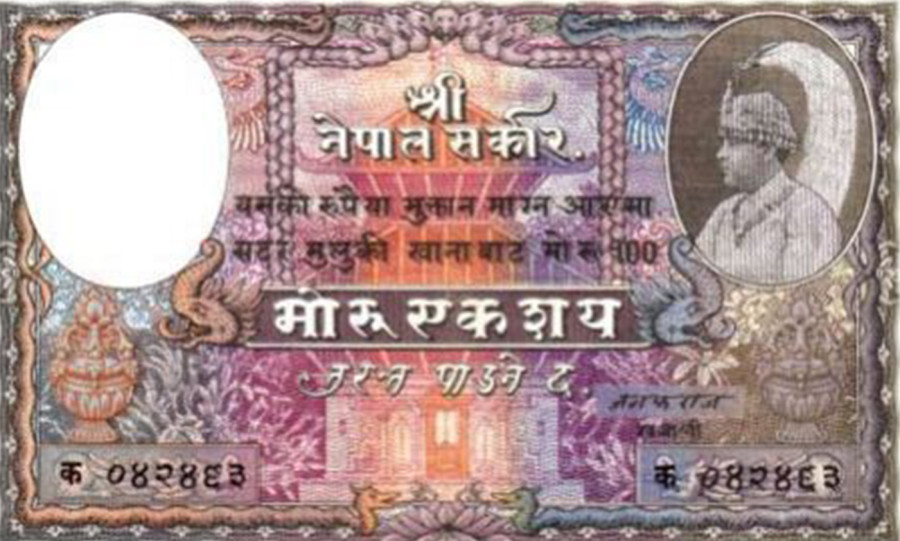
Abani Malla
With a stately elephant on the back, the thousand rupee note is a solemn and majestic piece of currency, larger than all others and ornate in its embellishments. Compared to the riotous greens of the hundred rupees or the vibrant tangerine of the twenty rupees, the thousand rupees is wreathed in muted greys, blacks and greens with just a hint of crimson.
But despite the fact that Nepali notes often show up on lists of the world’s most beautiful currencies, the aesthetic choices that led to the current look of the notes are ambiguous. Nepal Rastra Bank, the country’s central bank that designs and prints currency, is responsible for records regarding the history of the notes and how they evolved. However, officials at the bank say they have no idea about how the Nepali currency notes came about.
“We have no information on who designed the notes and why,” says Laxmi Prapanna Niraula, executive director of the Currency Management Department at Nepal Rastra Bank. “The Rastra Bank doesn’t have such records and I personally can’t say much about things that were in existence since I was a child.”
The mode and manner of currency evolve constantly and it is just recently that paper money has become the standard. From binding thread around a tiny soya bean to issuing the first coins during the Licchavi era (450-750 CE), Nepal now uses paper money, along with a few coins, exclusively. The notes come emblazoned with a signature of the governor and different animals on the reverse of different denominations. Ever since the first currency, Nepali notes have seen four generations of monarchs and 16 governors, along with countless smaller changes.
The first Nepali paper notes were issued by King Tribhuvan in 1945 and printed at India Security Press in Nashik, Maharashtra. They were called mohru, after mohar coins where two mohars equalled one mohru. These notes were rich in colour and embellished with birds, snakes and other animals, especially on the borders. In a violet-brown coloured five mohru note, a portrait of King Tribhuvan is positioned on the right in the obverse while the reverse has a jungle scene with a tiger surrounded by lush leaves, some even coming out of the frames—appearing alive and fresh—and paired with a font that resembles stone-carved Devanagari alphabets.
According to Rastra Bank officials, Juddha Shumsher had wanted to put his own picture and signature to the banknotes but was denied by the king.
“The department later decided to include the pictures of animals so that even the illiterate could figure out the value of the notes,” says Niraula.
Ever since those first Tribhuvan notes were issued, they’re undoubtedly the most widely circulated design language in all of Nepal.
“Everyone can associate with the animals on the notes and now, it’s a language that we all can refer to,” says Ujala Shrestha, a visual artist and designer. “The unique colour scheme for each note has also made it accessible, for even a child, to figure out its monetary value by just looking at it.”
Nepali banknotes are known for their diversity: the size, colours, animals, and their elemental design. The recently re-designed notes from 2018 also hold the same properties; in fact, they have been looking about the same since the 1970s, apart from a few minor changes in the pictures and replacement of the governor’s signature.

Rs 100 denominations along with their contemporary equivalents. Post photo: Anish Regmi
“People have become so familiar with the notes that it would be difficult to give it a complete redesign,” says Niraula, who is also a core member of the Design Committee at Nepal Rastra Bank. “We also have to think of suitable areas to place security features and make changes to the materials, too. So, it’s a serious matter and we don’t plan to do it any time soon.”
When Nepali banknotes got their first complete redesign in 1960, they were printed at De La Rue & Co in the United Kingdom. Later, another printing company, Bradbury Wilkinson & Co, also from the UK, acquired a contract to print notes of five, 10, and 20 denominations. In 1986, De La Rue acquired Bradbury Wilkinson & Co, leading all Nepali banknotes to be printed at De La Rue over the years, apart from a few occasional printing stints at other international presses. The currently circulated banknotes of Rs 5, 100, and 1,000 were printed at China Banknote Printing and Minting Corporation while Rs 20, 50, and 500 were printed at Perum Peruri, Indonesia, and Rs 10 were printed at France’s Oberthur Fiduciaire. However, even when the printing took place at different companies, the design has remained consistent.
Over the years, there have been attempts to change the texture, denominations and material of the notes. In 2002, the Rastra Bank experimented with polymer notes, modelled after Australia’s notes, which are all polymer. But the Rs 10 had disastrous consequences. While the notes didn’t tear, they faded with continued use, leaving just a blank plastic sheet. The polymer Rs 10 notes have since been discontinued.
Notes of Rs 2, 25 and 250 denominations have also been issued periodically but are not in regular circulation, leading these notes to become prized artefacts. These notes were designed by Sundar Shrestha, an artist and former designer at Nepal Rastra Bank. Sundar worked as a designer for the bank from 1979 to 2010 and in 1997, he got an opportunity to design the special edition Rs 25 and 250 notes for the silver jubilee of King Birendra’s accession to the throne.
Later, he also designed another special edition Rs 50 banknote that was printed to commemorate the Golden Jubilee of the Nepal Rastra Bank, in 2006.
“I was inspired by wood carvings and statues of animals that are placed at the entrances of temples,” says Sundar. “I wanted to represent our rich artistic culture.”
For the printing process, Shrestha said he visited a press in Germany. “They were surprised to learn that I drew it all by hand and they made a few changes digitally before printing,” he says.
However, the designer didn’t have as much freedom as he might’ve liked. The Design Committee can only propose a design, including security features, latent pictures, printing substance, and other materials. Other properties of the notes, like their size, denomination and pictures, need to be approved by the Government of Nepal.
“In design, ‘less is more’ but we had many elements to add in order to represent our country,” says the 54-year-old Sundar. “It’s not in my hands. If it were, I would have made some changes but for now, I like how they look.”
The designs for Nepali currency might be old but they continue to win plaudits from design enthusiasts, who point to the five core design elements for any note—size, colour, functionality, composition and symbolism. Design experts say different denominations should be of different sizes, so as to assist the visually impaired; different colours can also help to quickly identify what denominations the notes are; functionality has to do with how accessible the notes are to the visually impaired; composition is about the material, like paper or polymer; and finally, the symbols chosen for the currency say a lot about the country.
Scandinavian countries and Australia are often hailed for the design of their notes. Norway is already on its eighth series of banknotes based on the theme, ‘The Sea’. And as simple as it already sounds, so is its aesthetic, created by the Norwegian international architecture studio Snohetta.
There have been ideas for a redesign, especially since 2007 when the portrait of the king was replaced by one of Everest. Many designers have protested the inanity of placing an inert mountain on all currency and have pushed for a more modern redesign.
“Design is adaptive. So, currencies should be adaptive to change as well,” says Ujala. “Redesigning doesn’t always have to offer a completely new look. But we could opt to use portrait banknotes as we rotate the notes vertically to use them anyway. The denomination could also be written on the side for ease.”
But Nepal has been using the same framework for decades, without really even knowing who made it or understanding the symbology behind all of the elements on the notes.
“Ever since I was a child, I had questions on my mind after seeing the graphics of Nepali stamps and rupees,” says Shyam Prasad Khatiwada, an assistant at the Currency Management Department, whose book ‘Glimpses of Nepalese Currency’ provides a snapshot of Nepali currency and its evolution over the years. “There are many people who study Nepali notes but we don’t find enough resources for research as we don’t have a record system and the few records we did have were affected by the 2015 earthquakes.”

The first Nepali banknotes of Rs 5. Post photo: Anish Regmi
Over the years, the symbols on Nepali currency have changed with the times. Ever since the Licchavi period, a premium has been placed on symbols and what they mean. When King Mandev issued the first Nepali currency, the little circular coins had pictures of a lion on one side and a lioness on the other.
“During that time, a lioness was referred to as a devi. Some people called her other synonyms of a goddess,” says Khatiwada.
Similarly, after 2007 and the replacement of the king with Everest, even the security watermark that featured the royal crown was gradually replaced by a rhododendron, the national flower. Elements like the Ashoka pillar and a legend stating Lumbini as the birthplace of the Buddha have been added.
After the 2015 earthquakes, the new banknotes also saw changes to the monuments and animals. Only animals found in Nepal were used for the notes whereas earlier, there were animals from other continents. Before, the Rs 1,000 note had a picture of an African elephant, now twin elephants called Ram and Laxman, born in Chitwan National Park, are placed on the respective note. The portraiture and orientation of the animals have also changed. The photos of these animals were provided by the Department of Archaeology, says the Rastra Bank.
“We wanted to highlight endangered species and make people aware of their existence in Nepal,” says Niraula. “Even the temples that we have on the new notes are the ones affected by the 2015 earthquakes. So, it’s a way of paying tribute and remembering them.”
Although Nepali banknotes have been able to add much of the country’s entities and natural heritage, designers say the design is more than just having everything placed together.
“There are too many elements in the design and they are also inconsistent. For instance, Rs 100 from 2015 is the only one that contains the map of Nepal instead of a monument,” says Ujala. “It’s nice to be able to add elements but incorporating too much can make the note unrelatable.”
As a collector, Khatiwada too isn’t fully satisfied with the present designs. Everyone at Rastra Bank is concerned about improving how they look, but Nepal also needs to be able to afford them financially.
“Our notes would be better if we could feature some Nepali personalities and showcase national pride,” says Khatiwada. “Now, with the available advanced technology, we could enhance the paper and print quality, and upgrade security features to prevent counterfeit notes.”


 18.12°C Kathmandu
